How to use our templates
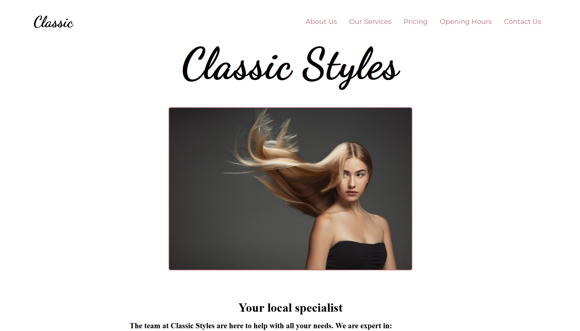
We’ve got two templates to choose from (one more coming soon). Pick the style that fits your business to get started. You’ll find more instructions on the individual page for each template, where you can choose your own images, fonts, text, and colours.
Some tips for getting started
- It’s usual (but not mandatory) to select different fonts for headings and body text, and very common to have one serif and one sans-serif font.
- Take a look at fonts.google.com for some ideas.
- Your headings should be short and punchy!
- Any text you send us will be incorporated into your site exactly as you send it to us. Please make sure you proof-read and spell check first.
- Image / Photo: this should be an image that shows your potential clients what they are getting. If you’re offering a personal service, this could be a photo of you, or your premises.
- Professional photos are best, but at the very least, please avoid using selfies.
- Please send a high-resolution image. We can re-size if necessary to reduce page-loading times.
- When specifying colours, please use the hex code (eg #E48A68). ‘Orange’ and ‘Green’ are just not specific enough.
- Colours can be tricky. If you already have a logo or colour-scheme, start from there. You can also use our standard palette if you prefer.
- Use a colour-picking tool such as colormind.io to pick complementary colours.

